“The feedback on our site has been awesome, people are commenting on the ease and professional face lift.”
Cheryl WhitemanExecutive DirectorFOCUS Accreditation helps human service organizations in Ontario improve their quality of services via training and accreditation. With over 98% annual client retention, their approach has helped numerous organizations deliver exceptional results to their communities.
When FOCUS reached out to us, they let us know that they were ready to build on their success with their existing clients and expand to reach new clients across Ontario. It was time to invest in their branding and marketing in order facilitate this growth.
Learning About FOCUS
We began by making sure we understood the details of FOCUS’s business, working with them to define their:
- Business Structure
- Goals and challenges
- Target audiences
- Brand personality
- Similar brands and competitors
This enabled us to put together an initial branding brief, which would provide direction for all future branding, marketing and communication activities.
Branding and Logo Design Process
With the branding brief complete, we worked with FOCUS to redesign their logo, which would be the visual cornerstone for their brand.
Step 1: Focusing on Shape and Typography
Our initial designs were in black and white, in order to enable us to focus on the logo’s shape and typography.
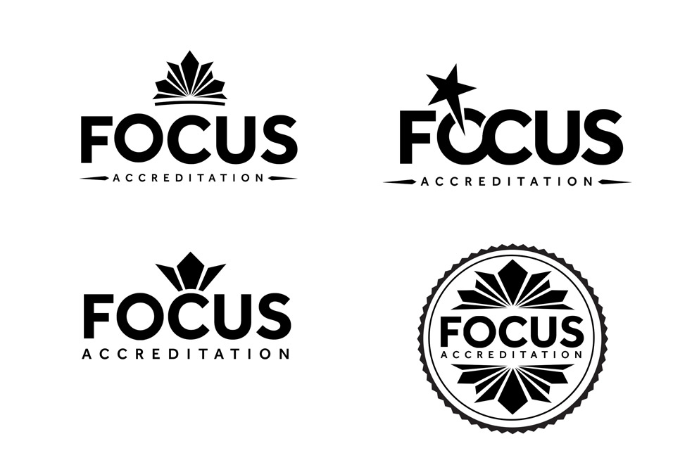
Step 2: Working with Colour
Once we had finalized the the shape–which communicated focus and professionalism, and alluded to the Canadian maple leaf–we worked colour options.
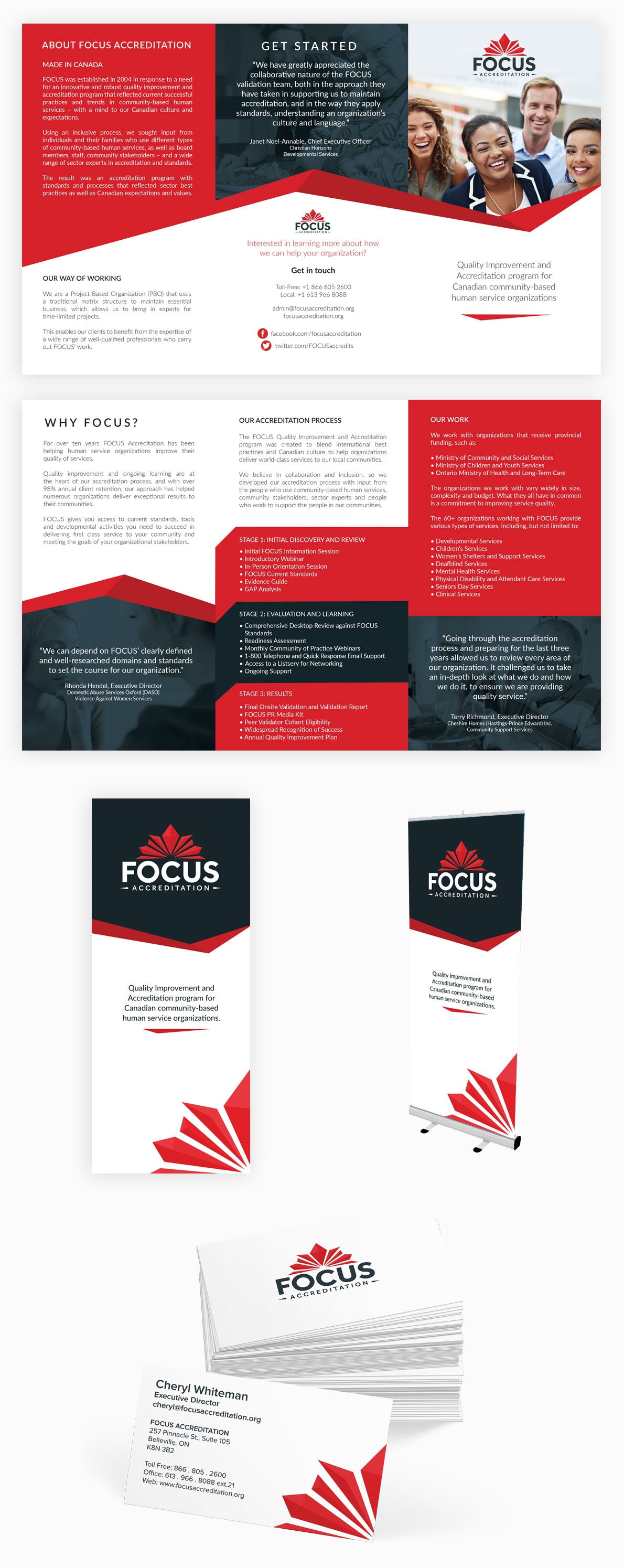
In the end, we decided that the red was the strongest colour. In addition to the core logo, we created several “seals” that their clients could use to show that they have passed through the accreditation program, which also helped to promote awareness of FOCUS across the province:
![]()
Designing Print Collateral: Business Cards, Brochures and Banners
With the new logo finalized, we moved on to apply the new branding to create several new pieces of print collateral, including business cards, brochures and banners.
Website Redesign
The most substantial element of this project was the redesign of FOCUS Accreditation’s website.
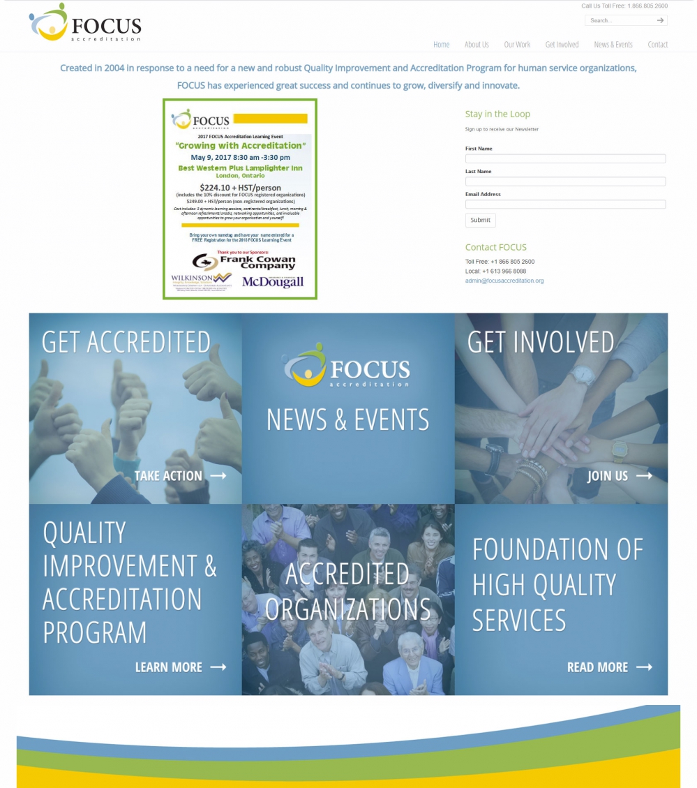
Original Website’s Design
The existing design was not mobile friendly, nor was it doing a good job at communicating their brand, services and value:
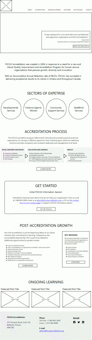
Planing and Wireframing
We worked with FOCUS to reorganize the content and redevelop the messaging, creating wireframes that illustrated how we could communicate with visitors and prioritize important content.
By starting with wireframes, we can really focus on the content itself and move through an iterative process where changes can be efficiently turned around before we begin the design stage.
New Design
Once the wireframes were finalized and the content reorganized, we created a fresh mobile-friendly design that built on the new branding and communicated the benefits of working with FOCUS Accreditation.
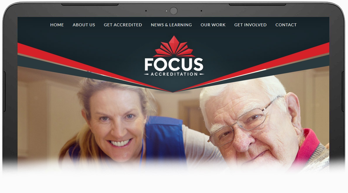
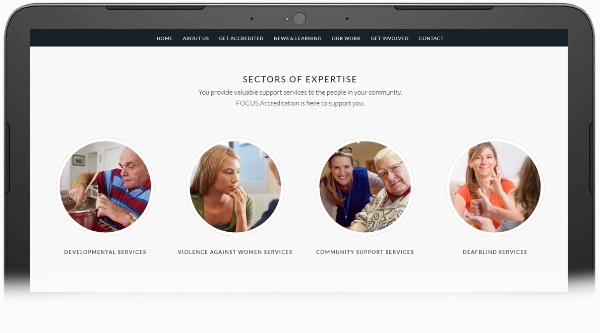
This design included doorways to sections devoted to its key target audiences.
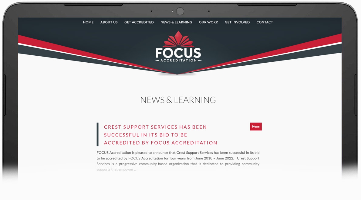
We also built a publishing tool that enables FOCUS to attract and engage visitors with new information about their clients and their industry.
Results
The new, redesigned website has provided a fantastic foundation for increased awareness and engagement. Comparing the six months since launch to the six months before launch:
- Traffic has increased by 40%
- The bounce rate has dropped by 20%
- Contact page visits have doubled