Your Audience is On Mobile
Mobile Usage Continues to Surge
It’s no secret that more and more people are using mobile devices like smartphones to browse the web. Recent research continues to reveal the prevalence of smartphone usage:
- Mobile has established the primary position across the globe, accounting for over half of the total “digital minutes”
- More than half of retail time is spent on mobile devices
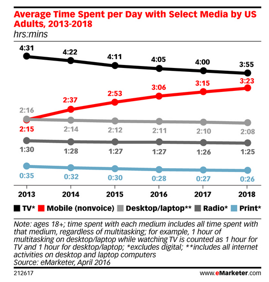
- In the United States, people spend 50% more time on their phone than on their desktop computer
- 48% of consumers start mobile research with a search engine
- Smartphones Now Capture Two-Thirds of US Digital Media Time
- Google says 61% of users are unlikely to return to a mobile site they had trouble accessing and 40% visit a competitor’s site instead
What this Means for You
If your website isn’t mobile-friendly, it will present a frustrating experience for your smartphone visitors. They are more likely to look elsewhere for information, products and services. Your conversion rates drop and so does their engagement with your brand.
If you’re wondering what how your website looks when viewed on a smartphone, you can use an online emulator to see how your website will look on a variety of devices.
Concerned that your website isn’t mobile-friendly?
We can help. Get in touch.
If You Aren’t Ready for Mobile, Your Search Traffic Will Drop
Google Has Rolled Out Its “Mobile-Friendly” Update
Since April 21, 2015, Google has been boosting the search rankings of mobile-friendly websites in their mobile search results. The broad-reaching effects of the change have led some to label this update as “mobilegeddon”. This change was further amplified by Google in March of 2016.
This is part of Google’s ongoing effort to provide the best possible search results for every context. Websites that are not mobile-friendly are going to show up further down in mobile search results.
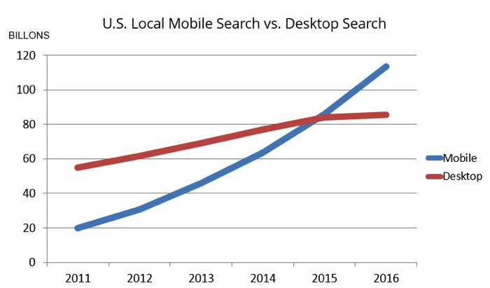
Image from Smart Insights.
What this Means for You
If a customer is searching for your products or services from their smart phone and your website is not mobile-friendly, your website now has a lower chance of showing up in their search results.
This means less traffic, fewer conversions and less sales.
You can use Google’s Mobile-Friendly testing tool to see if your website qualifies as mobile-friendly.
Concerned that your website isn’t mobile-friendly?
We can help. Get in touch.
What Can You Do About It?
Ensure That Your Website Responsively Adapts for Mobile Devices
There are several ways to develop a “mobile-friendly” website. The best-practice method preferred by Google is called “Responsive Design”.
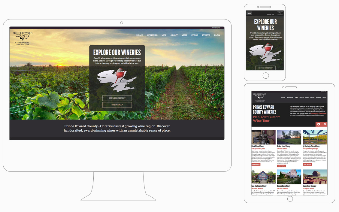
A website that has been responsively designed will automatically adjust its layout to so that it is optimized for the user’s screen size, whether it’s a large desktop monitor, a tablet or a smartphone.
“Responsive Design” is our standard practice and all of our website designs follow this principal, including:
- Prince Edward County Wine Growers’ Association
- Quinte International Air Show
- Bay of Quinte Region
- Habitat for Humanity
- Iris Power
Major benefits of responsive design include:
- Your site is mobile friendly!
- You do not need to spend extra time and money creating both a mobile version and a desktop version of your website
- The best user experience
- Cost effective
- Easier to manage
- Best for SEO (better link-building, no duplicate content, faster load times, improved search rankings, etc.)
We Can Help
Interested in ensuring that your website gets more search traffic and converts more customers? We’ve been designing responsive websites for years.